Sensors - Location Dashboard
Sensors help restaurants and businesses by combining both hardware (the physical sensors and gateways) and software (the dashboard and sensor details) to achieve team accountability and digital food safety compliance. The dashboard presents users with instant feedback on which units are working properly and which units currently have issues. This allows their team to quickly fix issues and helps get their business back to running smoothly.
For Jolt Software
Users of the previous sensors dashboard had several complaints such as it was hard to use, was difficult to see which sensors had issues, and required a lot of mental effort to figure out how to solve those issues.
My Role
I was the lead and solo designer on this project. I met with both my product manager, senior designer, and stakeholders throughout this project.
Team
Bill Masur - Product Manager
Greg Bird - Lead Web Developer
Christopher McClellan - Developer
Goal
The goal is to create a dashboard that would quickly and effectively show the status of the user’s sensors while also considering the future of how we want the product to look in terms of UI and design components.

Empathizing and Sketching
I began by going over the complaints that users had about the dashboard. I then proceeded to compile a list of information that would help decide the route I would take with the UI.
Primary users would be the employees at the physical location. Cashiers, cooks, etc.
Users are very busy running the restaurant and serving customers. They will have limited time to check on the dashboard.
Users would be the first to be able to act on and resolve issues
Users only want to see if there are issues. If everything is running fine they can go back to doing their primary job.
Using this information I decided to use cards to showcase the sensor information. This format can show multiple points of information and is easier to digest in comparison to the tables used in our previous dashboard. I sketched out multiple low fidelity wireframes of different cards.
During this process, I kept in mind what specific information I wanted to display on the cards. The information would allow users to quickly determine not only which sensors have issues, but the type of issue as well. This ensures that any user may swiftly implement the needed resolution to fix said issue. The important information is as follows:
Sensor name
Sensor status
Temperature
Humidity
Battery status
Card Exploration
I took some wireframes and converted them into high fidelity. I felt confident skipping mid fidelity greyscale to prioritize experimenting with color. I felt color was a great way to showcase and differentiate between the statuses of the sensors. I also found that color was universal among many users. Green typically signifies a positive status while red is a sign that there are issues present.
Defining the MVP
I decided to continue with the design on the bottom left with the graph. I put multiple cards next to each other, each with different data to see what the dashboard would look like. After doing this I felt the design was both visually cluttered and repetitive. I wanted to break up the design but didn’t know what other information would be pertinent to include. To get a better understanding of potential features I met with my Senior Designer and my Product Manager. We compiled a list and proceeded to vote on what we felt was most important. This meeting was incredibly helpful in:
Defining the MVP
Narrowing down how the dashboard and cards would look
Eliminating the humidity, as our sensors could not physically track that information
Deciding that the graphs were causing too much clutter and that users would only need to see this when there was a problem
Adding tiles at the top that would give a summary of all the sensors

Different States
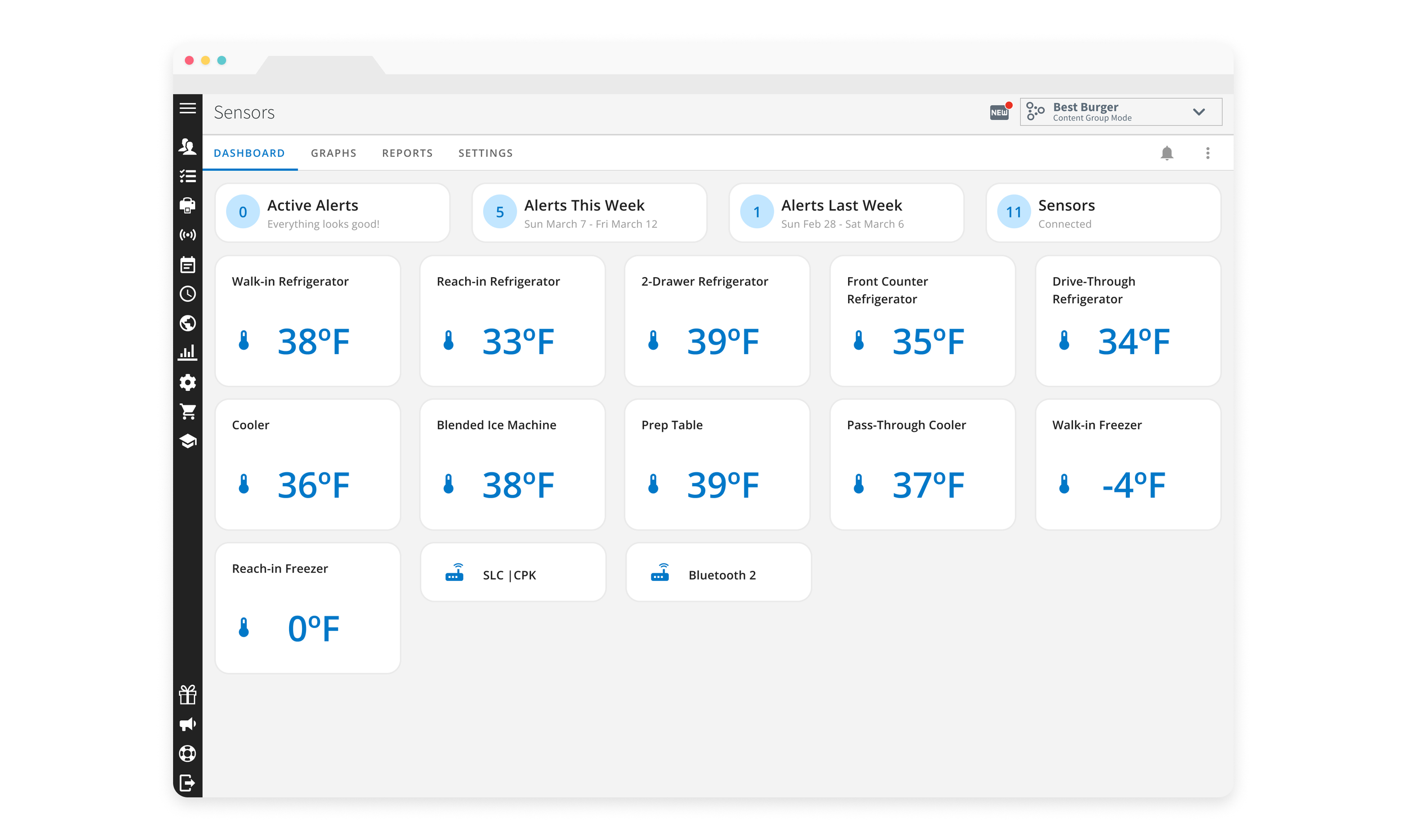
After deciding on the card design, I wanted to look into the different possible states the cards could be in. I determined there were four states.
Neutral state – Everything is working fine
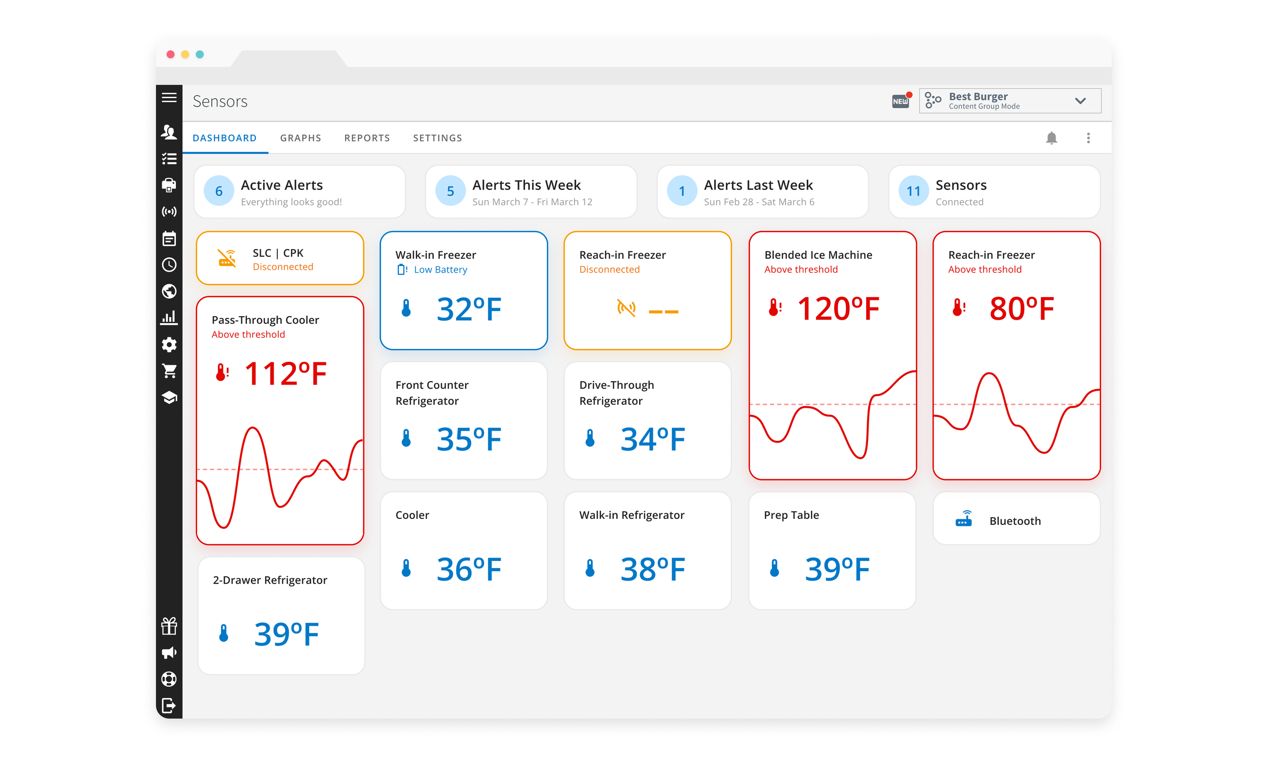
Temperature alert state – The unit has gone outside of the designated temperatures
Disconnected state – The sensor or gateway has been disconnected and is no longer sending readings
Low battery state – The sensor has a low battery and will need to be replaced soon
We had data that suggested that all of the alerts had different weights to them. This was based on importance and severity. ‘Temperature alerts’ were highest while ‘low battery’ was lowest. This was very important as I wanted the cards to be visually distinct enough for a user to glance at the dashboard and know quickly what the problem was. I knew I didn’t want the ‘neutral state’ to be too prominent so I left them as a neutral grey color. I tried all of the alerts as a red color. I found that with one or two sensors this worked well. However, I always want to account for the best scenario (everything is fine), the worst scenario (everything is not fine) and the most likely scenario (multiple sensors with a couple of issues).
Final Edits
I decided to try separating the different types of states even further. Looking back at the data that showed ‘temperature alerts’ as most important, I opted to keep them red. The red coloring along with the growth of the card in addition to the graph helped to visually separate the cards and drew the eye directly to the most important issue. These visual differences also help in the case of color blindness.
I decided to go with contrasting warm and cool colors and chose to show the system alert states such as ‘disconnects’ and ‘low batteries’ as blue. This would be the final design that was released to Beta users.
Feedback
After releasing the designs, we obtained feedback from several users that the ‘disconnect’ state was not prominent enough. I went back and did multiple iterations before deciding to go with a yellow card for the ‘disconnect’ state.
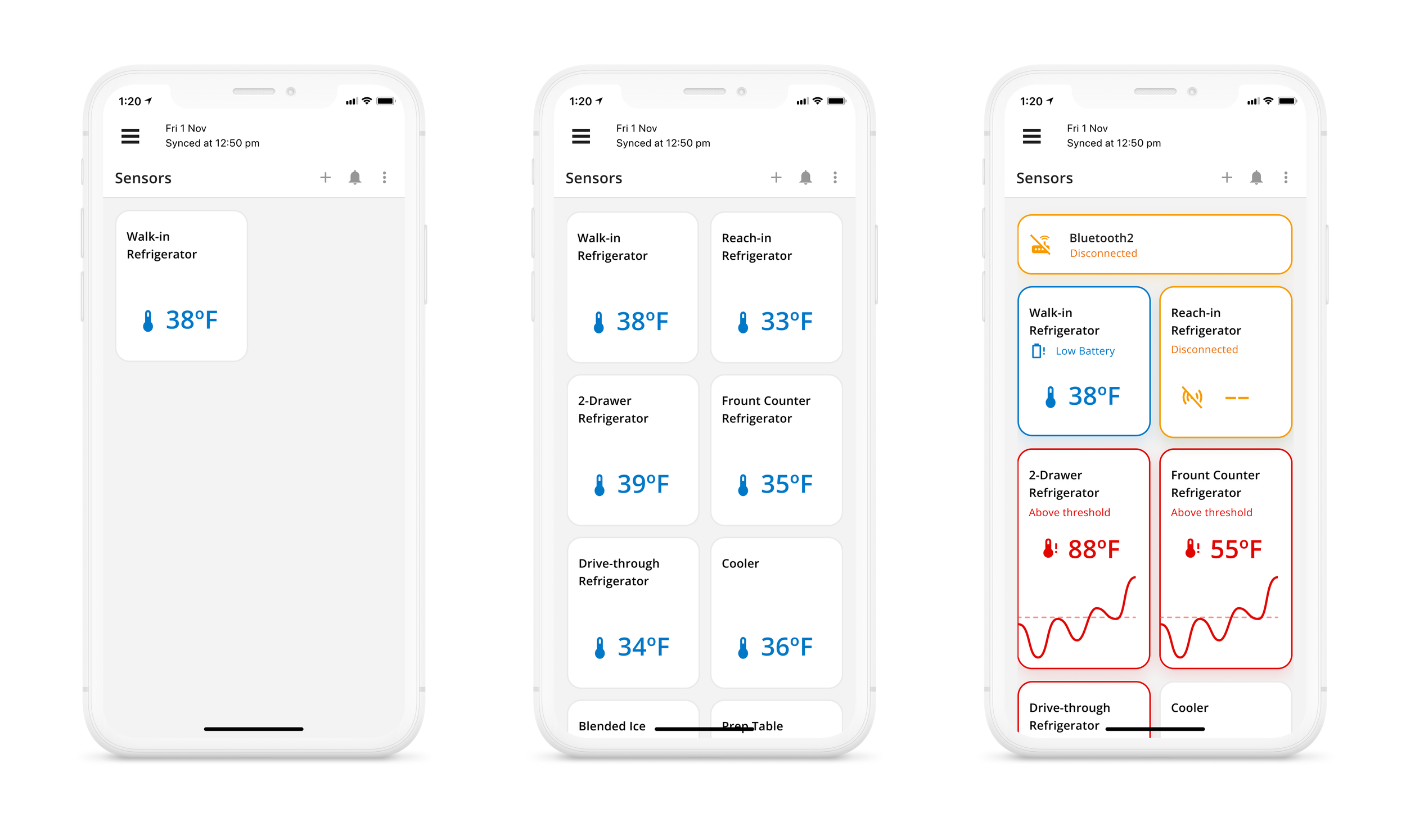
Final Designs and Last Thoughts
I gathered all of the high fidelity designs together and met with the Product Manager, Senior Designer, and Stakeholders to go over the designs before we developed them. The Stakeholders gave great feedback on the visual aspects and said we received high praise and positive comments from our Beta users.
The Sensors Dashboard is now released to all clients who have sensors.
Since being released, we received several comments on the Sensors Dashboard and how much better it has been to locate specific issues and see the status of sensors at a glance. Sensors sales increased this year by 33%.
Designing the Sensors Dashboard has been a great learning experience. I had not been at the company long when I started this project and it was a great opportunity to quickly synthesize a complex feature and provide a streamlined experience for users. I also got more hands on experience with Figma and their component and library system as well as their prototyping resources.
Being the only designer on this project presented me with a challenge knowing that other designers would not be there to provide different perspectives. Realizing that other designers were not available to collaborate with, I learned to recognize weaknesses in my design process that I am now able to self-correct and identify for future projects.
I felt the impact of my designs through feedback from both my Product Manager and the users in our User Groups. I feel fulfilled knowing how much happier users were with the Sensors Dashboard after the work that I had done.


